Case study · 01 / 03
BBL Operating brand mark
BBL Operating · est. 2018
◆ Brand Restart · 2026

Oil & gas with a sense of place.

Client BBL Operating
Sector Oil & Gas
Timeline 12 weeks
01

The work.

◆ The challenge

Two decades of operational credibility, a brand that hadn't kept up.

BBL Operating had grown from a single-well operator into a multi-asset independent in the Texas basin. But the brand still read like the startup it had been in 2001 — generic type, off-the-shelf corporate gloss, nothing that said “this company knows the field.”

◆ The approach

Two directions. One client. A deliberate choice.

Rather than iterate on a single concept, we developed two complete identity systems — each viable, each built against the same brief, each aiming at a different version of BBL’s future.

◆ The outcome

The heritage direction won — and earned its place.

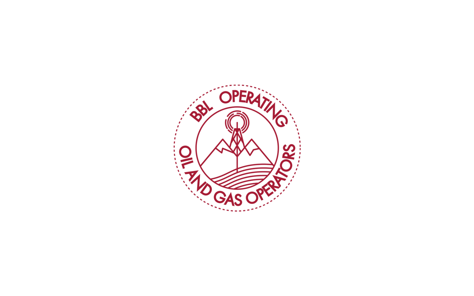
BBL chose the stamp system. It matched who the company actually was: operators first, office second. The new identity now lives everywhere from crew tote bags to the office envelope.

◆ The key ingredients to the final pick. Many iterations -- one cohesive image.

The Journey Great ingredients, make great meals!

◆ The road not taken · Logo exploration five rounds before the real one.
BBL Logo progression

From the archive Five stages of the "Big Finance" direction…

◆ The exploration

Two systems. Both viable.
Only one shipped as primary.

◆ Direction A shipped ✓ The <em>Stamp.</em>

The Stamp.

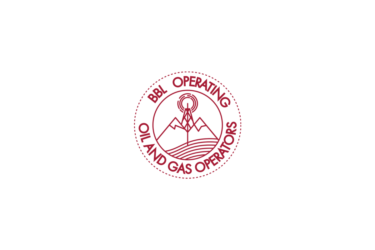
Heritage-forward, rugged, field-ready…

Crimson + kraft Illustrated seal Rugged texture — pipe-separated, renders as three chips
◆ Direction B concept only The <em>Finance.</em>

The Finance.

Corporate-forward, serif, editorial…

Navy + rust Serif wordmark Corporate polish
◆ Core palette
Crimson #7A1722
Kraft #F4ECE3
Rust #C7603A
Ink #1A2438
◆ Scope of engagement 4 deliverables · 12 weeks.
1
IDENTITY & MARK
Primary identity · Mark, wordmark, and primary lockups Secondary marks · Monograms, favicons, alternate lockups for constrained spaces Icon or symbol · Standalone glyph or badge for use as an app icon, favicon, or signal mark Logo exploration · Multiple directions developed in parallel, with rationale Logo refinement · Polish of an existing mark rather than a full redraw
2
TYPE & COLOR
Type system · Primary and secondary typeface pairing with usage rules Color system · Core palette, extended palette, and accent colors with hex codes Texture library · Brand textures, overlays, or pattern systems (kraft, splatter, grain, marble, etc.) Grid and layout system · Spatial rules that make the brand feel coherent across touchpoints
3
STATIONERY & PRINT
Business card system · Leadership, team, and general-use variants Letterhead · Print and digital templates Envelope system · Standard and custom sizes Notecards and thank-yous · Branded correspondence for personal touches Brochure or one-pager · Trifold, bifold, or single-sheet marketing piece Presentation template · Keynote, PowerPoint, or Google Slides — not a pitch deck, a template Report template · Quarterly or annual report format Form and document templates · Branded versions of invoices, contracts, proposals
4
MERCHANDISE & SWAG
Apparel · Shirts, hats, jackets, uniforms Team swag · Stickers, mugs, totes, notebooks Client or conference gifts · Higher-end branded items Field merch · Items intended for use in the work, not as gifts
◆ No pressure · 30 minutes

Ready to take your brand
to the next level ?

Send us what you have — site, deck, identity, whatever exists. We'll send back an honest write-up of what's working, what isn't, and where the fastest wins are hiding.